3 Months with a Surface Pro 2
I've had my Surface Pro 2 for around 3 months now, I was one of the people to pre-order and got it on the release day. I personally find reviews written by people that have had a device for a day a bit useless hence this review comes after 3 months with the device.
A bit about me
I also find reviews a bit useless unless you know what the reviewer needs from a device. We are not all the same and therefore need different things from a device. I don't need this device for work, but I do take it to work every day to use at lunch. As an app developer I needed something that I could use Visual Studio on, but I also wanted something that would function as a tablet on my sofa at home. My other devices are an iPad 3, iMac and Sony Vaio.
Onto the Pro
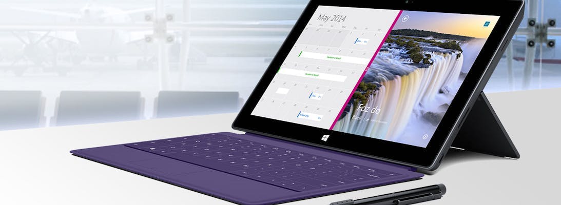
In the same way that the Xbox One has its name because it is the one device you need connected to your TV (at least according to Microsoft it is), the Surface Pro 2 could be called the Surface One, because it is the One PC you need. It truly is a tablet and laptop in one package. I write code on this thing almost every day and then do everything I would do on my iPad like email, games and web. Xbox Music on a tablet is also a dream to use and the fact that you can stream any song for free has made it a much better solution than my iPad.
When I got the Pro out of its box, my first thought was wow this things heavy! I was thinking of it as a tablet. When I gave it to my parents to hold, there reaction was wow this things light! They were thinking of it as a laptop. Depending on your perspective this is exactly what the weight is like. As a buyer what you need to consider what is important and what is too heavy. For me I know that compared to the new iPad this thing is miles away, but its not too heavy for a tablet. My Sony Vaio on the other hand as a laptop that I wanted to take to work, was too heavy. It required taking a bigger bag and its power supply due to the awful battery life. So after 3 months, speaking as someone who wanted one device, this thing is seriously light!
Battery life is the next consideration and let's just say, its got enough.

But what about the Keyboard
Surface is known for it's keyboard which has become one of it's biggest selling point, but also it's most popular criticisms along the lines of not being a great tablet if you need a keyboard to use it.
The keyboard is an optional accessory, to use Windows 8 you don't need it. When I sit on my sofa I don't use the keyboard, I actually pull it off. The on screen keyboard is a dream to use and I can't really fault it. But if you have a Surface Pro you're almost definitely going to want the keyboard accessory to get the most out of the device.
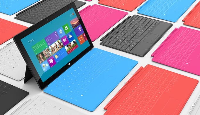
Despite having a Pro 2, I opted for an original Touch Cover. This was firstly because it was cheaper and secondly because I wanted a colour (did I mention my Vaio is bright orange). The Touch Cover 2 keyboard only came in black and although the Type Cover 2 has colours I really wanted to go for touch over type.
Typing on the Touch Cover can be an odd experience that will largely be dependant on how often you use it and how well you can type. As you type you can get a feeling that your making mistakes, even when you aren't. Then on occasion you will type a letter and nothing will appear, this leads you to start typing harder to ensure your getting the key presses. In reality you probably missed the key or keyboard completely. Key combinations can be another issue as the idea of holding down ctrl when nothing actually moves can be a little weird.
How well the Touch Cover keyboard works for you I think would largely be down to what you use it for. This article for instance has been fine. I'm doing constant typing and as such my fingers are learning the keyboard. Writing code on the other hand where it's a combination of autocompleted words, symbols, keyboard shortcuts and moving around files a lot can be a bit harder.
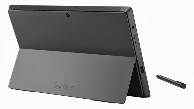
Was the Kickstand a good idea
Simple answer yes.

Would I recommend it?
It really depends what you want it for;
If your mainly after a device for typical laptop usage and aren't really interested in tablet usage, don't buy this device. The kickstand is great but it isn't as good as a laptop.
Equally if you mainly want a tablet and don't have much use aside from that don't buy the Pro version. The regular has some merits or an iPad may still be the better option.
If you want to use some classic Windows software such as real games (not that tablet games aren't real but you get what I mean) then get this device if you like the form factor.
If you want a tablet for work, get this device. It will be far more usable than any other tablet on the basis that it can do everything.
If you just want one device for all scenarios then this is also the one to get. It works that way for me, and if I ever did want it for work as well getting it's dock would make it perfect at that job to.