Tag: CSS3

HTML5 Series - Grid

There was a time when an HTML page layout mainly consisted of tables, and lots of them. Tables went inside other tables and complex layouts were achieved through the use of colspans and rowspans. The only problem though was it was a mess.

By using tables the HTML mark-up was dictating the design/layout of the page and if you ever wanted to change anything it was a huge task to undertake. Since then the world has moved on and now most webpages consist mainly of div's. But what if you did want to quite a rigid layout with columns and rows?

HTML5 introduces the Grid style through CSS. Your page can still consist mainly of div's (or anything for that matter), but in your css you set a display property of grid (for now in IE it's -ms-grid). You can then specify a grid-columns and grid-rows property to create a grid within your div.

Child items can be placed in grid cells through grid-row and grid-column properties in the CSS, and if you want something to span more than one cell you can use grid-row-span or grid-column-span.

If you've done any XMAL programming (WPF/Silverlight/Win8/Windows Phone) then this should all sound very similar to XMAL's Grid control.

The example below creates something like this:
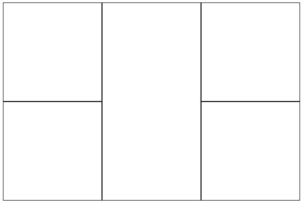
1<style>
2 /* Set a grid with 3 columns and 2 rows */
3 div {
4 display: -ms-grid;
5 -ms-grid-columns:200px 200px 200px;
6 -ms-grid-rows:200px 200px;
7 }
8
9 /* Position the child div's in the grid */
10 div:nth-child(1) {
11 -ms-grid-row: 1;
12 -ms-grid-column: 1;
13 }
14 div:nth-child(2) {
15 -ms-grid-row: 2;
16 -ms-grid-column: 1;
17 }
18 div:nth-child(3) {
19 -ms-grid-row: 1;
20 -ms-grid-column: 2;
21 -ms-grid-row-span:2; /* The middle cell spans 2 rows */
22 }
23 div:nth-child(4) {
24 -ms-grid-row: 1;
25 -ms-grid-column: 3;
26 }
27 div:nth-child(5) {
28 -ms-grid-row: 2;
29 -ms-grid-column: 3;
30 }
31
32 /* Add a border to the cells */
33 div>div {
34 border: solid 1px black;
35 }
36</style>
37<div class="myGrid">
38 <div></div>
39 <div></div>
40 <div></div>
41 <div></div>
42 <div></div>
43</div>

It's also worth noting that the column/row sizes can be specified using fractions rather than fixed sizes. e.g. The following will produce a grid 600px wide where the middle column is twice the width of the other 2.

1<style>
2 /* Set a grid with 3 columns and 2 rows */
3 div {
4 display: -ms-grid;
5 width:600px;
6 -ms-grid-columns:1fr 2fr 1fr;
7 -ms-grid-rows:200px 200px;
8 }
9</style>

For another great example check out this hands on page from Microsoft Hands on: CSS3 Grid

HTML5 Series - Fonts

It's an all to common story, designer designs a website hands it to a developer who then goes, "what kind of font is that?" and get's the response of some completely unheard of name. The developer then try's to explain what a web safe font is and they agree to use Arial.

With CSS3 custom fonts are now a reality. On the item you are styling you still set the font family in the same way but additionally in your CSS you specify a @font-face rule so the browser can find out what the font is. The @font-face rule should specify a name and the src of the font. e.g.

1@font-face {
2 font-family: myFont;
3 src: url('myFontFileName.ttf');
4}

One point to note different browsers support different font type. Luckily though you can specify multiple sources for your font.

HTML5 Series - Flexbox

If you've ever done any WPF, Silverlight, Windows Phone or Windows 8 development using xmal then you will appreciate how good it is to have controls like the StackPanel and Grid, and that HTML is rather lacking in its layout functionality. True you can produce most layouts but it just seems needlessely harder.

Thankfully HTML5 improves on this situation by introducing some new CSS properties.
The first is flexbox. When you define a div as a flexbox you can set its containing items to either space themselves out evenly, or you can set ratio values on each item to say how big it should be compared to the other items in the flexbox and they will stretch to fill the flebox.

Examples
In this example the flexbox is set to distributive which means the containing items will keep there size but distribute themselves evenly in the flexbox.

The key CSS is where the class example 1 sets the display to -ms-flexbox which makes example 1 div a flexbox container, and -ms-flex-pack: distribute, which set the flex mode to distribute the containing items evenly.

1 <style type="text/css">
2 .Example1 {
3 display:-ms-flexbox;
4 -ms-flex-pack:distribute;
5 width:400px;
6 border:solid 1px black;
7 }
8 .Example1 div:nth-child(1) {
9 background-color: red;
10 min-width:80px;
11 min-height:80px;
12 }
13 .Example1 div:nth-child(2) {
14 background-color: green;
15 min-width:80px;
16 min-height:80px;
17 }
18 .Example1 div:nth-child(3) {
19 background-color: blue;
20 min-width:80px;
21 min-height:80px;
22 }
23
24 </style>
25<div class="Example1">
26 <div></div>
27 <div></div>
28 <div></div>
29 </div>

In the next example the containing items have had ratios set so that the second item is twice the width of the first and the third remains at a fixed size.

The key CSS to look at here is on the child div's styles where it says -ms-flex: 1 or -ms-flex: 2.

1<style type="text/css">
2 .Example2 {
3 display:-ms-flexbox;
4 width:400px;
5 border:solid 1px black;
6 }
7 .Example2 div {
8 min-width: 80px;
9 min-height: 80px;
10 }
11 .Example2 div:nth-child(1) {
12 background-color: red;
13 -ms-flex: 1 0 auto;
14 }
15 .Example2 div:nth-child(2) {
16 background-color: green;
17 -ms-flex: 2 0 auto;
18 }
19 .Example2 div:nth-child(3) {
20 background-color: blue;
21 min-width:80px;
22 }
23</style>
24
25<div class="Example2">
26 <div></div>
27 <div></div>
28 <div></div>
29</div>

The third example shows how these techniques also work vertically as well as horizontally. See -ms-flex-direction:column on the containing div style.

1<style type="text/css">
2 .Example3 {
3 display:-ms-flexbox;
4 -ms-flex-direction:column;
5 width:400px;
6 border:solid 1px black;
7 }
8 .Example3 div {
9 min-width: 80px;
10 min-height: 80px;
11 }
12 .Example3 div:nth-child(1) {
13 background-color: red;
14 -ms-flex: 1 0 auto;
15 }
16 .Example3 div:nth-child(2) {
17 background-color: green;
18 -ms-flex: 2 0 auto;
19 }
20 .Example3 div:nth-child(3) {
21 background-color: blue;
22 min-width:80px;
23 }
24</style>
25<div class="Example3">
26 <div></div>
27 <div></div>
28 <div></div>
29</div>

Lastly in the fourth example I've shown how items can be set to wrap when they fill up a line with -ms-flex-wrap:wrap;

1<style type="text/css">
2 .Example4 {
3 display:-ms-flexbox;
4 -ms-flex-wrap:wrap;
5 width:400px;
6 border:solid 1px black;
7 }
8 .Example4 div {
9 min-width: 80px;
10 min-height: 80px;
11 }
12 .Example4 div:nth-child(1) {
13 background-color: red;
14 }
15 .Example4 div:nth-child(2) {
16 background-color: green;
17 }
18 .Example4 div:nth-child(3) {
19 background-color: blue;
20 }
21 .Example4 div:nth-child(4) {
22 background-color: yellow;
23 }
24 .Example4 div:nth-child(5) {
25 background-color: orange;
26 }
27 .Example4 div:nth-child(6) {
28 background-color: violet;
29 }
30</style>
31<div class="Example4">
32 <div></div>
33 <div></div>
34 <div></div>
35 <div></div>
36 <div></div>
37 <div></div>
38 <div></div>
39</div>

HTML5 SERIES – COLUMNS

I'm not sure I've ever needed to add columns where text flows from one into the other, but if your doing Windows 8 development where you would want a sideways scroll rather than vertical this could be quite useful.

To create columns using CSS3 you simply set the columns property to either the number of columns you want or the width each columns should be. e.g. This would produce 4 columns.

1<style type="text/css">
2 div {
3 columns: 4;
4 }
5</style>

There are a couple other properties that are also quite useful when using columns.

Column-Gap - Specifies the size of the gap between columns

Column-Fill - Can either be set to auto where columns are filled sequentially and have different lengths, or balance in which case the text will be balanced so each column is even. The default is balance.