HTML5 Series - Flexbox
If you've ever done any WPF, Silverlight, Windows Phone or Windows 8 development using xmal then you will appreciate how good it is to have controls like the StackPanel and Grid, and that HTML is rather lacking in its layout functionality. True you can produce most layouts but it just seems needlessely harder.
Thankfully HTML5 improves on this situation by introducing some new CSS properties.
The first is flexbox. When you define a div as a flexbox you can set its containing items to either space themselves out evenly, or you can set ratio values on each item to say how big it should be compared to the other items in the flexbox and they will stretch to fill the flebox.
Examples
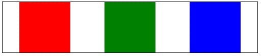
In this example the flexbox is set to distributive which means the containing items will keep there size but distribute themselves evenly in the flexbox.
The key CSS is where the class example 1 sets the display to -ms-flexbox which makes example 1 div a flexbox container, and -ms-flex-pack: distribute, which set the flex mode to distribute the containing items evenly.
1 <style type="text/css">2 .Example1 {3 display:-ms-flexbox;4 -ms-flex-pack:distribute;5 width:400px;6 border:solid 1px black;7 }8 .Example1 div:nth-child(1) {9 background-color: red;10 min-width:80px;11 min-height:80px;12 }13 .Example1 div:nth-child(2) {14 background-color: green;15 min-width:80px;16 min-height:80px;17 }18 .Example1 div:nth-child(3) {19 background-color: blue;20 min-width:80px;21 min-height:80px;22 }2324 </style>25<div class="Example1">26 <div></div>27 <div></div>28 <div></div>29 </div>
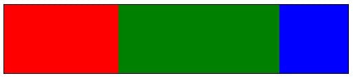
In the next example the containing items have had ratios set so that the second item is twice the width of the first and the third remains at a fixed size.
The key CSS to look at here is on the child div's styles where it says -ms-flex: 1 or -ms-flex: 2.
1<style type="text/css">2 .Example2 {3 display:-ms-flexbox;4 width:400px;5 border:solid 1px black;6 }7 .Example2 div {8 min-width: 80px;9 min-height: 80px;10 }11 .Example2 div:nth-child(1) {12 background-color: red;13 -ms-flex: 1 0 auto;14 }15 .Example2 div:nth-child(2) {16 background-color: green;17 -ms-flex: 2 0 auto;18 }19 .Example2 div:nth-child(3) {20 background-color: blue;21 min-width:80px;22 }23</style>2425<div class="Example2">26 <div></div>27 <div></div>28 <div></div>29</div>
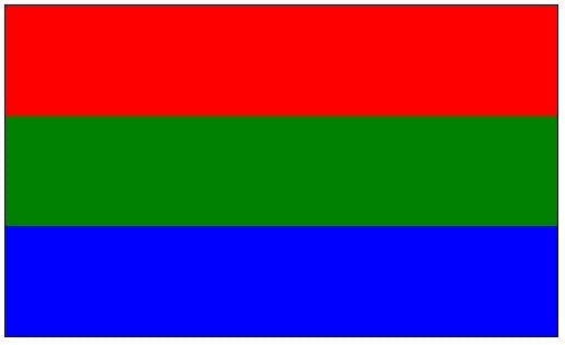
The third example shows how these techniques also work vertically as well as horizontally. See -ms-flex-direction:column on the containing div style.
1<style type="text/css">2 .Example3 {3 display:-ms-flexbox;4 -ms-flex-direction:column;5 width:400px;6 border:solid 1px black;7 }8 .Example3 div {9 min-width: 80px;10 min-height: 80px;11 }12 .Example3 div:nth-child(1) {13 background-color: red;14 -ms-flex: 1 0 auto;15 }16 .Example3 div:nth-child(2) {17 background-color: green;18 -ms-flex: 2 0 auto;19 }20 .Example3 div:nth-child(3) {21 background-color: blue;22 min-width:80px;23 }24</style>25<div class="Example3">26 <div></div>27 <div></div>28 <div></div>29</div>
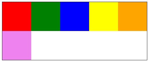
Lastly in the fourth example I've shown how items can be set to wrap when they fill up a line with -ms-flex-wrap:wrap;
1<style type="text/css">2 .Example4 {3 display:-ms-flexbox;4 -ms-flex-wrap:wrap;5 width:400px;6 border:solid 1px black;7 }8 .Example4 div {9 min-width: 80px;10 min-height: 80px;11 }12 .Example4 div:nth-child(1) {13 background-color: red;14 }15 .Example4 div:nth-child(2) {16 background-color: green;17 }18 .Example4 div:nth-child(3) {19 background-color: blue;20 }21 .Example4 div:nth-child(4) {22 background-color: yellow;23 }24 .Example4 div:nth-child(5) {25 background-color: orange;26 }27 .Example4 div:nth-child(6) {28 background-color: violet;29 }30</style>31<div class="Example4">32 <div></div>33 <div></div>34 <div></div>35 <div></div>36 <div></div>37 <div></div>38 <div></div>39</div>