Tag: Front End

HTML5 Series - Location

Being able to get a users location opens up some great functionality especially when used on mobile devices that could be anywhere. HTML5 makes it really easy to capture the users latitude and longitude in just a couple of lines of JavaScript.

What's important to remember though is the user always has the option of denying your request for their location so error handling is very important.

First you need to check to see if the device actually support geolocation by doing navigator.geolocation

1if (navigator.geolocation) {
2 // success code to go here
3} else {
4 alert("location not supported");
5}

Next we need to call navigator.geolocation.getCurrentPosition to get the current location. As capturing a location isn't something that happens instantly (first the browser will check with the user that this is ok and then it may take a few seconds for the device to actually work out the location) you need to provide a function that will be called when the location has been established.

After that accessing the location is easy just look at the coords.latitude and cords.longitude properties on the object that was returned to your callback function.

1<script>
2 function getLocation() {
3 if (navigator.geolocation) {
4 navigator.geolocation.getCurrentPosition(function (location) {
5 document.getElementById("latitude").innerText = location.coords.latitude;
6 document.getElementById("longitude").innerText = location.coords.longitude;
7 }, function (error) {
8 alert(error.code);
9 });
10 } else {
11 alert("location not supported");
12 }
13 }
14</script>
15
16Latitude: <span id="latitude"></span>
17Logitude: <span id="longitude"></span>
18
19<button onclick="getLocation();">Get location</button>
20

HTML5 Series - Audio

Traditionally if you wanted Audio on your page you would embed it in a Flash object. But when Steve Jobs declared that the iPhone would never support Flash or any other plug in's, there was suddenly a demand that browsers would need to support this natively and in a consistent way between browsers.

In HTML5 we can do this using the Audio tag. e.g.

1<audio controls>
2 <source src="url of the file" type="audio/mp3">
3 Your browser doesn't support audio.
4</audio>

The above example demonstrates setting the file source for the audio with the source tag, the controls tag tells the browser to show audio controls and there is also some text that will be displayed if the browser doesn't support audio.

It is also possible to set multiple source tags to reference different file formats as not all browsers support the same ones. Alternatively when setting just one source, a src tag can be placed on the actual audio node rather than as a child element.

Other settings which could be set include:

autoplay - determines if the file should start playing on the page load
loop - specifies that the file should repeat when it's finished
preload - instructs the browser to start downloading the audio file when the page has loaded

HTML5 Series - Flexbox

If you've ever done any WPF, Silverlight, Windows Phone or Windows 8 development using xmal then you will appreciate how good it is to have controls like the StackPanel and Grid, and that HTML is rather lacking in its layout functionality. True you can produce most layouts but it just seems needlessely harder.

Thankfully HTML5 improves on this situation by introducing some new CSS properties.
The first is flexbox. When you define a div as a flexbox you can set its containing items to either space themselves out evenly, or you can set ratio values on each item to say how big it should be compared to the other items in the flexbox and they will stretch to fill the flebox.

Examples
In this example the flexbox is set to distributive which means the containing items will keep there size but distribute themselves evenly in the flexbox.

The key CSS is where the class example 1 sets the display to -ms-flexbox which makes example 1 div a flexbox container, and -ms-flex-pack: distribute, which set the flex mode to distribute the containing items evenly.

1 <style type="text/css">
2 .Example1 {
3 display:-ms-flexbox;
4 -ms-flex-pack:distribute;
5 width:400px;
6 border:solid 1px black;
7 }
8 .Example1 div:nth-child(1) {
9 background-color: red;
10 min-width:80px;
11 min-height:80px;
12 }
13 .Example1 div:nth-child(2) {
14 background-color: green;
15 min-width:80px;
16 min-height:80px;
17 }
18 .Example1 div:nth-child(3) {
19 background-color: blue;
20 min-width:80px;
21 min-height:80px;
22 }
23
24 </style>
25<div class="Example1">
26 <div></div>
27 <div></div>
28 <div></div>
29 </div>

In the next example the containing items have had ratios set so that the second item is twice the width of the first and the third remains at a fixed size.

The key CSS to look at here is on the child div's styles where it says -ms-flex: 1 or -ms-flex: 2.

1<style type="text/css">
2 .Example2 {
3 display:-ms-flexbox;
4 width:400px;
5 border:solid 1px black;
6 }
7 .Example2 div {
8 min-width: 80px;
9 min-height: 80px;
10 }
11 .Example2 div:nth-child(1) {
12 background-color: red;
13 -ms-flex: 1 0 auto;
14 }
15 .Example2 div:nth-child(2) {
16 background-color: green;
17 -ms-flex: 2 0 auto;
18 }
19 .Example2 div:nth-child(3) {
20 background-color: blue;
21 min-width:80px;
22 }
23</style>
24
25<div class="Example2">
26 <div></div>
27 <div></div>
28 <div></div>
29</div>

The third example shows how these techniques also work vertically as well as horizontally. See -ms-flex-direction:column on the containing div style.

1<style type="text/css">
2 .Example3 {
3 display:-ms-flexbox;
4 -ms-flex-direction:column;
5 width:400px;
6 border:solid 1px black;
7 }
8 .Example3 div {
9 min-width: 80px;
10 min-height: 80px;
11 }
12 .Example3 div:nth-child(1) {
13 background-color: red;
14 -ms-flex: 1 0 auto;
15 }
16 .Example3 div:nth-child(2) {
17 background-color: green;
18 -ms-flex: 2 0 auto;
19 }
20 .Example3 div:nth-child(3) {
21 background-color: blue;
22 min-width:80px;
23 }
24</style>
25<div class="Example3">
26 <div></div>
27 <div></div>
28 <div></div>
29</div>

Lastly in the fourth example I've shown how items can be set to wrap when they fill up a line with -ms-flex-wrap:wrap;

1<style type="text/css">
2 .Example4 {
3 display:-ms-flexbox;
4 -ms-flex-wrap:wrap;
5 width:400px;
6 border:solid 1px black;
7 }
8 .Example4 div {
9 min-width: 80px;
10 min-height: 80px;
11 }
12 .Example4 div:nth-child(1) {
13 background-color: red;
14 }
15 .Example4 div:nth-child(2) {
16 background-color: green;
17 }
18 .Example4 div:nth-child(3) {
19 background-color: blue;
20 }
21 .Example4 div:nth-child(4) {
22 background-color: yellow;
23 }
24 .Example4 div:nth-child(5) {
25 background-color: orange;
26 }
27 .Example4 div:nth-child(6) {
28 background-color: violet;
29 }
30</style>
31<div class="Example4">
32 <div></div>
33 <div></div>
34 <div></div>
35 <div></div>
36 <div></div>
37 <div></div>
38 <div></div>
39</div>

HTML5 SERIES – COLUMNS

I'm not sure I've ever needed to add columns where text flows from one into the other, but if your doing Windows 8 development where you would want a sideways scroll rather than vertical this could be quite useful.

To create columns using CSS3 you simply set the columns property to either the number of columns you want or the width each columns should be. e.g. This would produce 4 columns.

1<style type="text/css">
2 div {
3 columns: 4;
4 }
5</style>

There are a couple other properties that are also quite useful when using columns.

Column-Gap - Specifies the size of the gap between columns

Column-Fill - Can either be set to auto where columns are filled sequentially and have different lengths, or balance in which case the text will be balanced so each column is even. The default is balance.

HTML5 Series - Forms

Forms haven't really changed in functionality since they were first invented, but with HTML5 the browser is going to add a lot of the functionality you've previously been hand coding through JavaScript/jQuery.

HTML5 now supports things like setting a field to be required or adding some html text that disappears when you click in the field. Some of the new tags include:

  • required - Determines if the field must be filled in
  • placeholder - Text to be displayed before the user enters a value
  • autofocus - Default the curser to the field with this set
  • pattern - A regex expression to validate the field
  • min / max - Specify the min and max values that can be entered

For more visit the HTML5 form attributes page on W3Schools

There are also new input types that will restrict the data that can be entered and the way the field is rendered such as:

  • colour
  • date
  • datetime
  • email
  • month
  • number
  • range
  • search
  • tel
  • time
  • url
  • week

For more view is the HTML5 form input types page on W3Schools

HTML5 Series - Semantic Tags

Before HTML5 the HTML for your page's layout was probably primarily made up of a lot of div tags with id's a class's to give them a visual structure and layout. It might look something like this...

1<div id="header">My Site Name</div>
2<div id="content">Bla bla bla site content......</div>
3<div id="footer">Privacy policy, copywrite info etc</div>

This though has 2 problems. Firstly it's not great for computers like search engines or screen readers to understand as everything is a div. There is extra code you can add to improve on this (have a look at Scheme.org). Secondly your code isn't very, again because everything is a div.

HTML5 however introduces new semantic tags like <header>and
<footer> to make your data more structured. So the above example would become...

1<header>My Site Name</header>
2<article>Bla bla bla site content......</article>
3<footer>Privacy policy, copywrite info etc</footer>

Other tags are as follows:

Tag Description

<article> For external content, like text from a news-article, blog, forum, or any other content from an external source

<aside> For content aside from the content it is placed in. The aside content should be related to the surrounding content

<details> For describing details about a document, or parts of a document

<summary> A caption, or summary, inside the details element

<figure> For grouping a section of stand-alone content, could be a video

<figcaption> The caption of the figure section

<footer> For a footer of a document or section, could include the name of the author, the date of the document, contact information, or copyright information

<header> For an introduction of a document or section, could include navigation

<hgroup> For a section of headings, using

<h1> to <h6>, where the largest is the main heading of the section, and the others are sub-headings

<mark> For text that should be highlighted

<meter> For a measurement, used only if the maximum and minimum values are known

<nav> For a section of navigation

<progress> The state of a work in progress

<section> For a section in a document. Such as chapters, headers, footers, or any other sections of the document

<time> For defining a time or a date, or both

URL parameters with Javascript

So this took me by surprise the other day. JavaScript doesn't have a function to retrieve a URL parameter value. i.e. There is no Request.Querystring command! Of course it wouldn't start Request as it's executing on the browser rather than the server but you would have thought there would be a built in command to do it.

After a bit of searching though I came across this script that does it:

1// Read a page's GET URL variables and return them as an associative array.
2function getUrlVars()
3{
4 var vars = [], hash;
5 var hashes = window.location.href.slice(window.location.href.indexOf('?') + 1).split('&amp;amp;');
6 for(var i = 0; i &amp;lt; hashes.length; i++)
7 {
8 hash = hashes[i].split('=');
9 vars.push(hash[0]);
10 vars[hash[0]] = hash[1];
11 }
12 return vars;
13}

The function returns an array/object containing the parameters and their values. e.g. The following URL:

http://www.example.com/?Name=Tim&Sex=Male

Would return:

1{
2 "Name": "Tim",
3 "Sex": "Male"
4}

To use it in your code you would write

1var name = getUrlVars()["Name"];

And that's it

Browser Testing IE Versions

Anyone in Web development knows that they should be testing their products on all browsers including different versions, which presents a problem when your only using the one PC. Programs like Multiple IE aren't great and often you can find yourself trying to fix a problem that doesn't actually exist on the proper version.

The best solution is the have virtual machines running on your own machine, but these take time to set up and most developers tend to have little time to spare as it is. Well thankfully if you want to test Internet Explorer you don't have to set the virtual machine up yourself, just head to the following address and you can download one from Microsoft's site. Save the address as you will have to keep downloading it every 3 months due to them building in a time bomb as it is essentially a free OS.

http://www.microsoft.com/downloads/details.aspx?FamilyId=21EABB90-958F-4B64-B5F1-73D0A413C8EF&displaylang=en

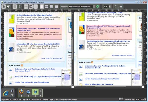
The second option also from Microsoft is Super Preview that is planned to be part of their Expression package. Currently it's only at the Beta stage but it if you enter an address it will give you a side by side comparison of a page in IE 6/7/8, plus its free. The full version when it's ready is meant to have support for all the popular browsers (but then you will have to pay for it to). However it is also limited to just being a preview so as far as testing all your JavaScript functions goes, you still need your virtual machines for that.