Tag: CSS
Force clients to refresh JS/CSS files

Force clients to refresh JS/CSS files

It's a common problem with an easy solution. You make some changes to a JavaScript of CSS file, but your users still report an issue due to the old version being cached.

You could wait for the browsers cache to expire, but that isn't a great solution. Worse if they have the old version of one file and the new version of another, there could be compatibility issues.

The solution is simple, just add a querystring value so that it looks like a different path and the browser downloads the new version.

Manually updating that path is a bit annoying though so we use modified time from the actual file to add the number of ticks to the querystring.

UrlHelperExtensions.cs

1using Utilities;
2using UrlHelper = System.Web.Mvc.UrlHelper;
3
4namespace Web.Mvc.Utils
5{
6 public static class UrlHelperExtensions
7 {
8 public static string FingerprintedContent(this UrlHelper helper, string contentPath)
9 {
10 return FileUtils.Fingerprint(helper.Content(contentPath));
11 }
12 }
13}

FileUtils.cs

1using System;
2using System.IO;
3using System.Web;
4using System.Web.Caching;
5using System.Web.Hosting;
6
7namespace Utilities
8{
9 public class FileUtils
10 {
11 public static string Fingerprint(string contentPath)
12 {
13 if (HttpRuntime.Cache[contentPath] == null)
14 {
15 string filePath = HostingEnvironment.MapPath(contentPath);
16
17 DateTime date = File.GetLastWriteTime(filePath);
18
19 string result = (contentPath += "?v=" + date.Ticks).TrimEnd('0');
20 HttpRuntime.Cache.Insert(contentPath, result, new CacheDependency(filePath));
21 }
22
23 return HttpRuntime.Cache[contentPath] as string;
24 }
25 }
26}
Optimize the Rich Text Editor in Sitecore

Optimize the Rich Text Editor in Sitecore

When it comes to building a Sitecore site your first thought probably isn't that you are going to need to make any setting updates or customization's to the rich text editor. After all when you learn about building a site its mostly focused around creating components to add and remove from pages, but there are a couple of things that will greatly enhance your content editors experience.

Configure the toolbars

Out the box Sitecore ships with 4 toolbar configurations. These are defined in the core db here:

  • /sitecore/system/Settings/Html Editor Profiles/Rich Text Default
  • /sitecore/system/Settings/Html Editor Profiles/Rich Text Full
  • /sitecore/system/Settings/Html Editor Profiles/Rich Text IDE
  • /sitecore/system/Settings/Html Editor Profiles/Rich Text Medium

The "Rich Text Default" toolbar

The "Rich Text Full" toolbar

The "Rich Text IDE" toolbar

The "Rich Text Medium" toolbar

As the name suggests, by default your content editors will see the default toolbar that contains a very limited number of options. This may in-fact be to limited and you need to offer the content editors one of the toolbar's with more options. Equally, the full toolbar may give to many options such as font's and you would want to offer a more restricted set of options.

Setting a toolbar on a field

You can set a toolbar on each individual field by specifying the path in the template fields source field. This is particularly useful when a field needs specific options, such as a text area that should allow a user to configure bold, italics and links but shouldn't ever contain an image.

Updating the default toolbar for a rich text field

When you want to change the toolbar for all rich text fields, a better option is to update which toolbar is used by default. You can do this with a patch config file.

1<?xml version="1.0" encoding="utf-8" ?>
2<configuration xmlns:patch="http://www.sitecore.net/xmlconfig/">
3 <sitecore>
4 <settings>
5 <setting name="HtmlEditor.DefaultProfile" value="/sitecore/system/Settings/Html Editor Profiles/Rich Text Full" />
6 </settings>
7 </sitecore>
8</configuration>

Updating the rich text editor CSS

A second way of customizing the rich text editor that you should consider is to make changes to the CSS file that the editor uses. By default this will use a CSS file called default.css that you will find in the root of the site. You can see this being referenced form a config setting if you look at the showconfig.aspx page.

1<!-- WEB SITE STYLESHEET
2 CSS file for HTML content of Sitecore database.
3 The file pointed to by WebStylesheet setting is automatically included in Html and Rich Text fields.
4 By using it, you can make the content of HTML fields look the same as the actual Web Site
5-->
6<setting name="WebStylesheet" value="/default.css" />

You can change this to use a different CSS file using a patch config file as follows:

1<configuration xmlns:patch="http://www.sitecore.net/xmlconfig/">
2 <sitecore>
3 <settings>
4 <setting name="WebStylesheet">
5 <patch:attribute name="value">/rich-text-editor.css</patch:attribute>
6 </setting>
7 </settings>
8 </sitecore>
9</configuration>

Now you may be wondering why you would want to do this, after all Sitecore offers an experience editor mode that will show the entire webpage as it will appear to visitors and also offers inline editing. However some aspects of a page can be better achieved using CSS styles rather than new components or new fields and content editor will need both an easy was to apply these style and a visual way to see that they have been applied, irrespective of if they are using the experience editor or the content editor.

For example, in this section of a blog post from Scott Hanselman he has highlighted some text as an aside which can easily be achieved in a rich text editor by applying a CSS class.

The first step to enabling this in Sitecore is to make sure you're using a toolbar that allows the user to select CSS classes (that's any but the default).

Next by creating a stylesheet that just contains the relevant style to be applied, the content editor can now select this in the CSS drop down;

1.aside {
2 border-left: 2px solid #e2842c;
3 background-color: #f7f7f7;
4 padding: 5px;
5 margin: 5px;
6 display: block;
7}

UI resources for developers

Having a good UI is possibly one of the most important aspects of any development. It doesn't matter how perfectly the code executes, if the thing looks awful people won't use it. But it is an area that a lot of developers struggle with.

There have always been things like website skins that you can buy, but I've never been a huge fan of these. It's always seemed odd that you can use an open source CMS for free that has had hundreds of man hours put into it, but a decent skin would cost you £100, and even then would still need a lot of work doing on it.

Thankfully there are some free resources that not only help with the css and making a site responsive, but they also include some fairly decent fonts and layouts.


Bootstrap

Bootstrap is possibly the most popular css framework for building sites with right now. Even Microsoft have adopted it into all the templates that ship with Visual Studio 2013.

One of the main things Bootstrap gives you is a standard set of css classes for doing things like grids and responsive layouts. When people start using a common set of classes to achieve the same thing, things get a lot more compatible and you can already see that starting to happen with Bootstrap.

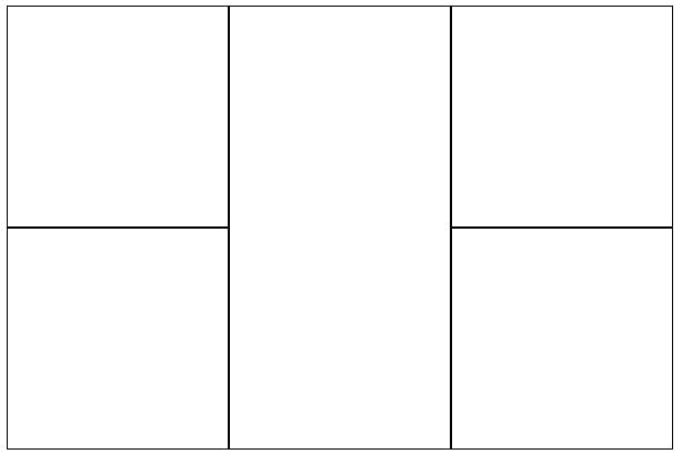
Bootstraps grid system works on having the illusion that your page is divided up into 12 columns. You then have a set of classes to assign to a div that contain a number, that number is how many columns the div should span over. A bit like a colspan on a table.

These grids are responsive though so as your page shrinks down to a tablet and mobile size it will automatically recognise that the columns won't fit horizontally and start rearranging them underneath each other.

As a starting point Bootstrap also has some templates of common layouts to get you started.

Bootstrap also has default classes for forms, form fields, headings and lists that will give your site an initial face lift.
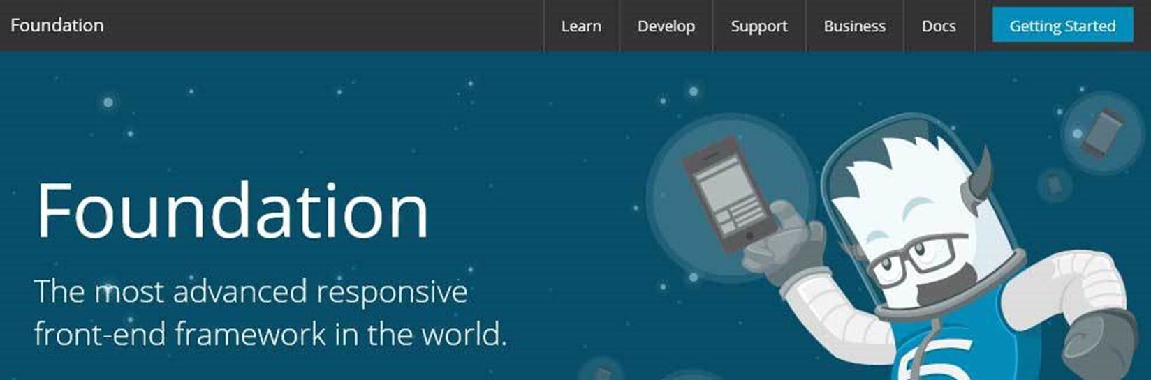
 

Foundation

Foundation in many ways is very similar to Bootstrap. It also has a grid system for layouts and also helps with making a site responsive. There are also default styles for headings, lists and forms but they have also taken things a step further and started to encroach on jQuery UI's territory with things like tabs and dialog windows.

I haven't heard of as much industry support but there site is full of documentation and videos on how to use the framework.
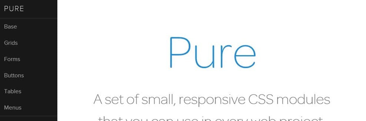
 

Pure

Another CSS framework with yet another grid system. Pure appears to be much simpler than the first two and offers many of the same features. Their site has some good templates that in some ways cover more scenarios that Bootstraps. Personally out of the three I would go with Bootstrap as it appears to have a much higher adoption.
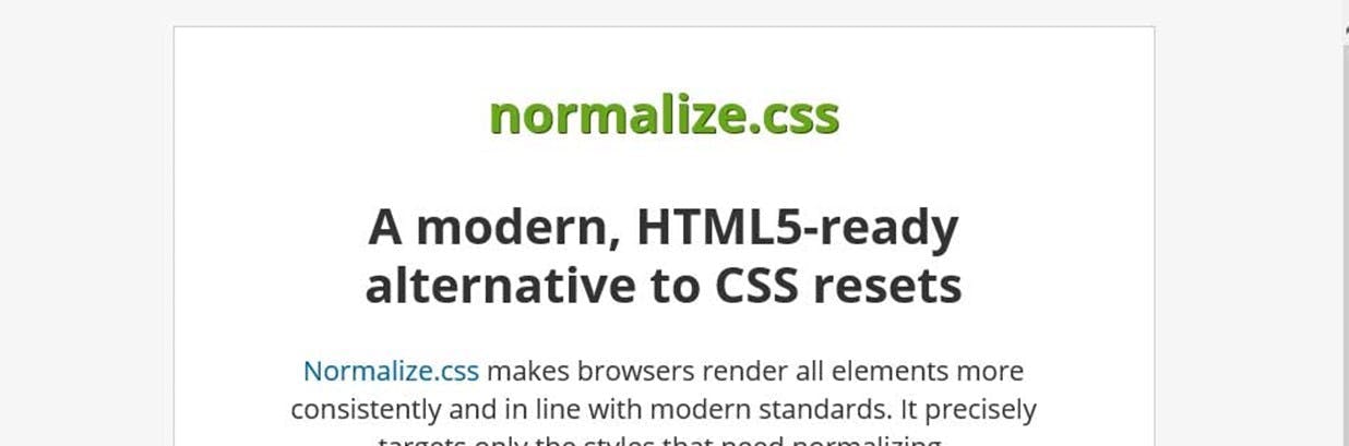
 

Normalize

If the CSS frameworks seem a little overkill for what you're after have a look at Normalize. The concept is simple, by including this CSS file in your site as the first CSS file it will overwrite all the default browser styles to create consistency and something that looks a little nicer.

There's been many incidents where I've seen CSS produced that includes a style for every single html element try overcome the differences on browsers, which is a good idea (this is basically what normalize does except someone's written it for you), but the styles have all been set to the same thing which is generally margin:0, padding:0. On some elements this is fine, on lists though, not so much.

Another option I've seen is to define a style on *.* which is equally as bad.
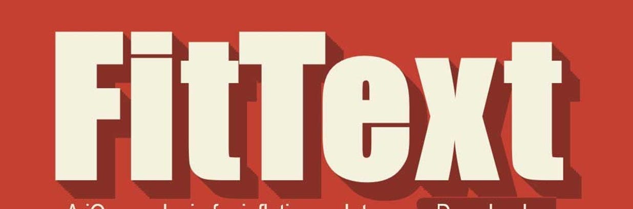
 

Fit Text

Like it or not people are accessing sites from all kinds of devices these days with all kinds of screen sizes. If your site doesn't scale then you're going to lose visitors. One issue you will ultimately face at some point is font sizes. These can easily be changed using media queries but another option is to use FitText.

FitText is a really simple bit of JavaScript that will scale your text to fit its containing element. You do have to call a function for each element you want to scale, and it does only work on the width rather than taking the height into account. But it is very cool. Just make sure you have a look at the code because it's so small this isn't something you will want in a separate JS file.

HTML5 Series - Grid

There was a time when an HTML page layout mainly consisted of tables, and lots of them. Tables went inside other tables and complex layouts were achieved through the use of colspans and rowspans. The only problem though was it was a mess.

By using tables the HTML mark-up was dictating the design/layout of the page and if you ever wanted to change anything it was a huge task to undertake. Since then the world has moved on and now most webpages consist mainly of div's. But what if you did want to quite a rigid layout with columns and rows?

HTML5 introduces the Grid style through CSS. Your page can still consist mainly of div's (or anything for that matter), but in your css you set a display property of grid (for now in IE it's -ms-grid). You can then specify a grid-columns and grid-rows property to create a grid within your div.

Child items can be placed in grid cells through grid-row and grid-column properties in the CSS, and if you want something to span more than one cell you can use grid-row-span or grid-column-span.

If you've done any XMAL programming (WPF/Silverlight/Win8/Windows Phone) then this should all sound very similar to XMAL's Grid control.

The example below creates something like this:

1<style>
2 /* Set a grid with 3 columns and 2 rows */
3 div {
4 display: -ms-grid;
5 -ms-grid-columns:200px 200px 200px;
6 -ms-grid-rows:200px 200px;
7 }
8
9 /* Position the child div's in the grid */
10 div:nth-child(1) {
11 -ms-grid-row: 1;
12 -ms-grid-column: 1;
13 }
14 div:nth-child(2) {
15 -ms-grid-row: 2;
16 -ms-grid-column: 1;
17 }
18 div:nth-child(3) {
19 -ms-grid-row: 1;
20 -ms-grid-column: 2;
21 -ms-grid-row-span:2; /* The middle cell spans 2 rows */
22 }
23 div:nth-child(4) {
24 -ms-grid-row: 1;
25 -ms-grid-column: 3;
26 }
27 div:nth-child(5) {
28 -ms-grid-row: 2;
29 -ms-grid-column: 3;
30 }
31
32 /* Add a border to the cells */
33 div>div {
34 border: solid 1px black;
35 }
36</style>
37<div class="myGrid">
38 <div></div>
39 <div></div>
40 <div></div>
41 <div></div>
42 <div></div>
43</div>

It's also worth noting that the column/row sizes can be specified using fractions rather than fixed sizes. e.g. The following will produce a grid 600px wide where the middle column is twice the width of the other 2.

1<style>
2 /* Set a grid with 3 columns and 2 rows */
3 div {
4 display: -ms-grid;
5 width:600px;
6 -ms-grid-columns:1fr 2fr 1fr;
7 -ms-grid-rows:200px 200px;
8 }
9</style>

For another great example check out this hands on page from Microsoft Hands on: CSS3 Grid

HTML5 Series - Fonts

It's an all to common story, designer designs a website hands it to a developer who then goes, "what kind of font is that?" and get's the response of some completely unheard of name. The developer then try's to explain what a web safe font is and they agree to use Arial.

With CSS3 custom fonts are now a reality. On the item you are styling you still set the font family in the same way but additionally in your CSS you specify a @font-face rule so the browser can find out what the font is. The @font-face rule should specify a name and the src of the font. e.g.

1@font-face {
2 font-family: myFont;
3 src: url('myFontFileName.ttf');
4}

One point to note different browsers support different font type. Luckily though you can specify multiple sources for your font.

HTML5 Series - Flexbox

If you've ever done any WPF, Silverlight, Windows Phone or Windows 8 development using xmal then you will appreciate how good it is to have controls like the StackPanel and Grid, and that HTML is rather lacking in its layout functionality. True you can produce most layouts but it just seems needlessely harder.

Thankfully HTML5 improves on this situation by introducing some new CSS properties.
The first is flexbox. When you define a div as a flexbox you can set its containing items to either space themselves out evenly, or you can set ratio values on each item to say how big it should be compared to the other items in the flexbox and they will stretch to fill the flebox.

Examples
In this example the flexbox is set to distributive which means the containing items will keep there size but distribute themselves evenly in the flexbox.

The key CSS is where the class example 1 sets the display to -ms-flexbox which makes example 1 div a flexbox container, and -ms-flex-pack: distribute, which set the flex mode to distribute the containing items evenly.

1 <style type="text/css">
2 .Example1 {
3 display:-ms-flexbox;
4 -ms-flex-pack:distribute;
5 width:400px;
6 border:solid 1px black;
7 }
8 .Example1 div:nth-child(1) {
9 background-color: red;
10 min-width:80px;
11 min-height:80px;
12 }
13 .Example1 div:nth-child(2) {
14 background-color: green;
15 min-width:80px;
16 min-height:80px;
17 }
18 .Example1 div:nth-child(3) {
19 background-color: blue;
20 min-width:80px;
21 min-height:80px;
22 }
23
24 </style>
25<div class="Example1">
26 <div></div>
27 <div></div>
28 <div></div>
29 </div>

In the next example the containing items have had ratios set so that the second item is twice the width of the first and the third remains at a fixed size.

The key CSS to look at here is on the child div's styles where it says -ms-flex: 1 or -ms-flex: 2.

1<style type="text/css">
2 .Example2 {
3 display:-ms-flexbox;
4 width:400px;
5 border:solid 1px black;
6 }
7 .Example2 div {
8 min-width: 80px;
9 min-height: 80px;
10 }
11 .Example2 div:nth-child(1) {
12 background-color: red;
13 -ms-flex: 1 0 auto;
14 }
15 .Example2 div:nth-child(2) {
16 background-color: green;
17 -ms-flex: 2 0 auto;
18 }
19 .Example2 div:nth-child(3) {
20 background-color: blue;
21 min-width:80px;
22 }
23</style>
24
25<div class="Example2">
26 <div></div>
27 <div></div>
28 <div></div>
29</div>

The third example shows how these techniques also work vertically as well as horizontally. See -ms-flex-direction:column on the containing div style.

1<style type="text/css">
2 .Example3 {
3 display:-ms-flexbox;
4 -ms-flex-direction:column;
5 width:400px;
6 border:solid 1px black;
7 }
8 .Example3 div {
9 min-width: 80px;
10 min-height: 80px;
11 }
12 .Example3 div:nth-child(1) {
13 background-color: red;
14 -ms-flex: 1 0 auto;
15 }
16 .Example3 div:nth-child(2) {
17 background-color: green;
18 -ms-flex: 2 0 auto;
19 }
20 .Example3 div:nth-child(3) {
21 background-color: blue;
22 min-width:80px;
23 }
24</style>
25<div class="Example3">
26 <div></div>
27 <div></div>
28 <div></div>
29</div>

Lastly in the fourth example I've shown how items can be set to wrap when they fill up a line with -ms-flex-wrap:wrap;

1<style type="text/css">
2 .Example4 {
3 display:-ms-flexbox;
4 -ms-flex-wrap:wrap;
5 width:400px;
6 border:solid 1px black;
7 }
8 .Example4 div {
9 min-width: 80px;
10 min-height: 80px;
11 }
12 .Example4 div:nth-child(1) {
13 background-color: red;
14 }
15 .Example4 div:nth-child(2) {
16 background-color: green;
17 }
18 .Example4 div:nth-child(3) {
19 background-color: blue;
20 }
21 .Example4 div:nth-child(4) {
22 background-color: yellow;
23 }
24 .Example4 div:nth-child(5) {
25 background-color: orange;
26 }
27 .Example4 div:nth-child(6) {
28 background-color: violet;
29 }
30</style>
31<div class="Example4">
32 <div></div>
33 <div></div>
34 <div></div>
35 <div></div>
36 <div></div>
37 <div></div>
38 <div></div>
39</div>

HTML5 SERIES – COLUMNS

I'm not sure I've ever needed to add columns where text flows from one into the other, but if your doing Windows 8 development where you would want a sideways scroll rather than vertical this could be quite useful.

To create columns using CSS3 you simply set the columns property to either the number of columns you want or the width each columns should be. e.g. This would produce 4 columns.

1<style type="text/css">
2 div {
3 columns: 4;
4 }
5</style>

There are a couple other properties that are also quite useful when using columns.

Column-Gap - Specifies the size of the gap between columns

Column-Fill - Can either be set to auto where columns are filled sequentially and have different lengths, or balance in which case the text will be balanced so each column is even. The default is balance.